Halloween Special: 10 Website Design Tips and Tricks
And, Halloween is approaching us. Yeah!!
Every year, 31 October is celebrated as a Halloween day. There are sweet treats and decorations all around the corner. It is an ideal time for dressing up with scary customers, for some entertainment and shaking things up. Every other person loves this time of the year; they do tons of things- decorating the house, and offices with candy bowls, crazy-spook characters, and cobwebs, etc.
Halloween is the universally celebrated (second largest) holiday, in North America, and the United States especially.
Find out the below statistics to check the immense popularity of Halloween:
- $8.8 bn is the annual Halloween expenditure in the United States.
- Costume expenditure in the United States is $3.2 bn.
- The estimated customer expenditure in the United States is $86.27.
- Almost 68% of participation is observed.
Keeping these figures into consideration, it is evident why the retailers spend their productive time decorating or for other chaos.
Since you are ready to make your presence for its celebration, then why your integrated channels should be left behind? Why not bring this festival spirit online?
Here, we are talking about social media and your online presence. Moving brilliantly and using this time to the best can provide your website with immense traffic. Trick and treat your WordPress website design to get it Halloween ready!!
Contact WordPress Experts for WordPress Website Design and Development
The Internet has given us plenty of tools that could be used to Halloweenify the WordPress website. Consider the fact that- "every single effort counts." So, any extra effort can make your Halloween website design get noticed. Indeed, will give your website design a fresh look. Dressing up your website can give you definite advantages, as mentioned below:
- Keep the festival intact and, similarly, draws visitor's attention towards your website/brand.
- Let you celebrate Halloween with your potential customers uniquely and amusingly.
- Improves your brand's story
- Use every bit of this festival with the holiday icons and symbols.
Apparently, you must have got convinced to integrate the hint of Halloween in your WordPress website design. Let's get started!!
Best Website Design Tips and Tricks for Halloween Effect
1. Modify Your Themes color scheme - Bloody glimpse
Colour plays effectively and effects the souls directly. Make the use of colours carefully so that they can drive more customers to your website. Therefore, keep them bright for Halloween website design.
And when it is about Halloween, keep the colours dazzling and radiant. Undoubtedly, WordPress, as the best CMS, has given us plenty of options that we can choose from.
Though, you can modify the colour setting the way you want. Let your emotions get connected with the audience. Therefore, if you aspire to change the theme's background, font colours, colours for Call-to-action (CTA), then go for it.
Remember that the colours do not clash with the background colour palette and description. The aim here is only to shock the visitors, not to make them fear.
2. Go with the scary fonts
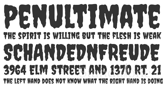
When it is about the deep-rooted things in brand identity (such as; fonts), it becomes complex to get rid of the predefined characteristics. Because WordPress has a plethora of free fonts (available online), then incorporating the scary font to give a subtle feel of Halloween is an easy task.
Tip: Less is always more
Consider the above fact in mind and change the font in the right proportion. Do not make it look clumsy. Several fonts that give a hint of Halloween are tad dramatic, Therefore, make it integrate that to the header text of your WordPress website or, pop-ups, suitable locations, and on the hero images, etc.
3. Add ghosty element to social icons
![]()
Give your social icons a feel of Halloween by using extra characters. Those who have a massive social media presence can add the elements so that they can reflect the agenda of your brand, as well. The trick is- when your social links visit your page to follow or share the content, you can discover those social links to keep them engaged. That simultaneously enhances your web presence.
4. Give a hint of the spookiness with 404 error
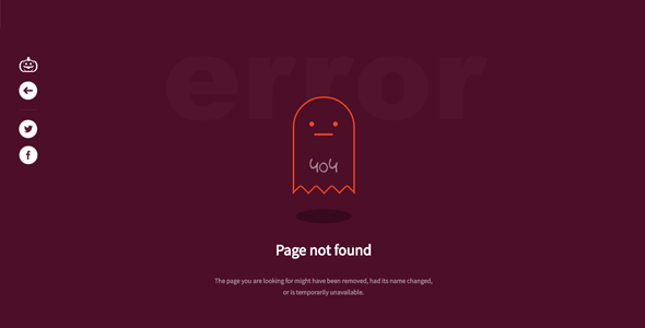
No businesses want to display the 404 error when some visitors visit their website. It has a negative impact on your brand. And hampers your customer satisfaction rate. But, if in any case, it happens, then give them a feel of Halloween by making it more scarier. This does not hurt your brand image and even makes visitors more festive.
5. Make Promotions the Priority
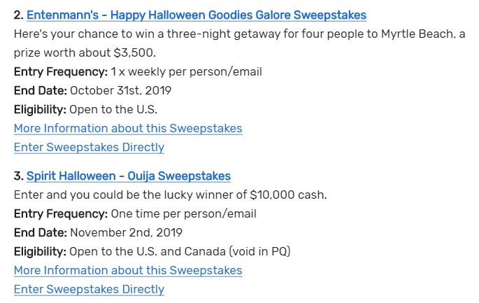
Let your customers feel that you care for them. Give away several discounts and offers according to their preferences. Find out below some of the promotional events that you can count on:
-
Special offers:
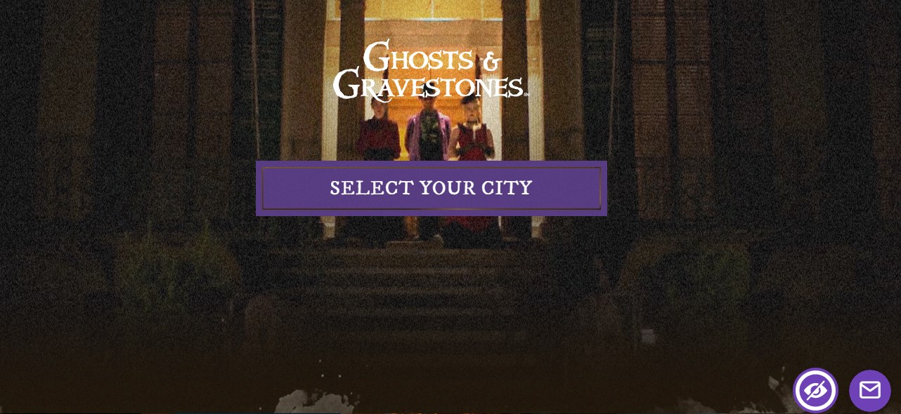
Use the pop-ups on your website to notify the customers/visitors about the offers your company is providing. Make the products and the services Halloween related. As in Ghosts and Gravestones, the scary offers are mentioned at the end of the page. There is a SignUp from that one has to fill to get their offers by filling the required credentials.
-
Surveys:
You can integrate the poll or the new survey on your WordPress website. Do not get too committed to amalgamate the subject or the question related to your website. If you are getting leads by adding in only the Halloween related content, then just go for it. -
Contests:
Ask the social media followers and the website followers to share their Photos. But, the photos should be related to your brand, that should reflect the Halloween. Use only the promotional and handle hashtags.
Some practices are there that you should follow while promoting your brand in Halloween:
- Whom do you want to target?
- What is your gateway to message delivery?
- Have you examined the product or services you want to promote?
- How the winners or participants will be examined?
- When are you going to provide offers and deals?
Examining the factors at the initial stage can only give you further benefits.
Get Your Website Theme Fully Customized Now!
6. Trick your Tagline
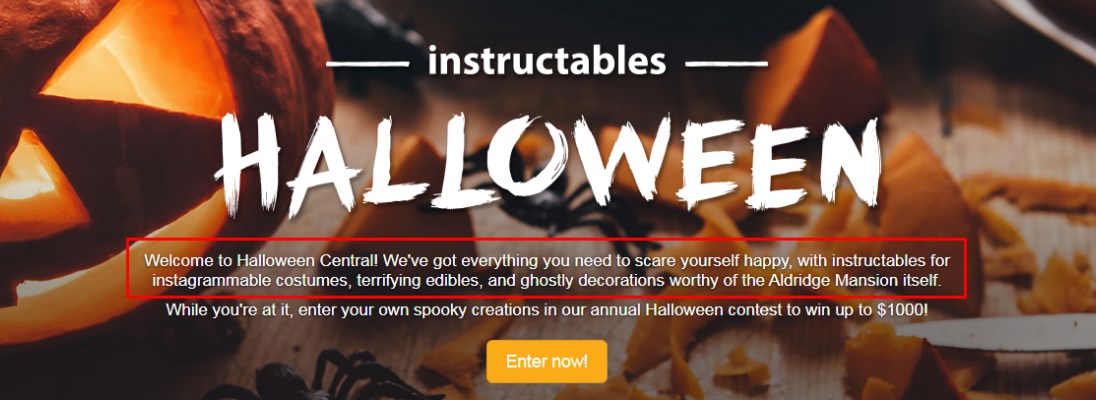
Give your tagline an angle of Halloween. Use your logo maker and trick the tagline. For instance, the brand ‘Rayban’ has used “Never hide” and “Express Yourself” last year by using the newsletter with the “Be yourself. Just on Halloween” subject line. Some of the taglines that you can use for your web development business could be; Join us if you dare for a Halloween scare, Creativity bleeds from the pen of inspiration, etc.
Have a look at this example that will make it easy for you to grasp. Instructables has mentioned the tag line “Welcome to Halloween Central! We've got everything you need to scare yourself happy, with Instructables for instagrammable costumes, terrifying edibles, and ghostly decorations worthy of the Aldridge Mansion itself”.
7. Haunted Homepage Integration
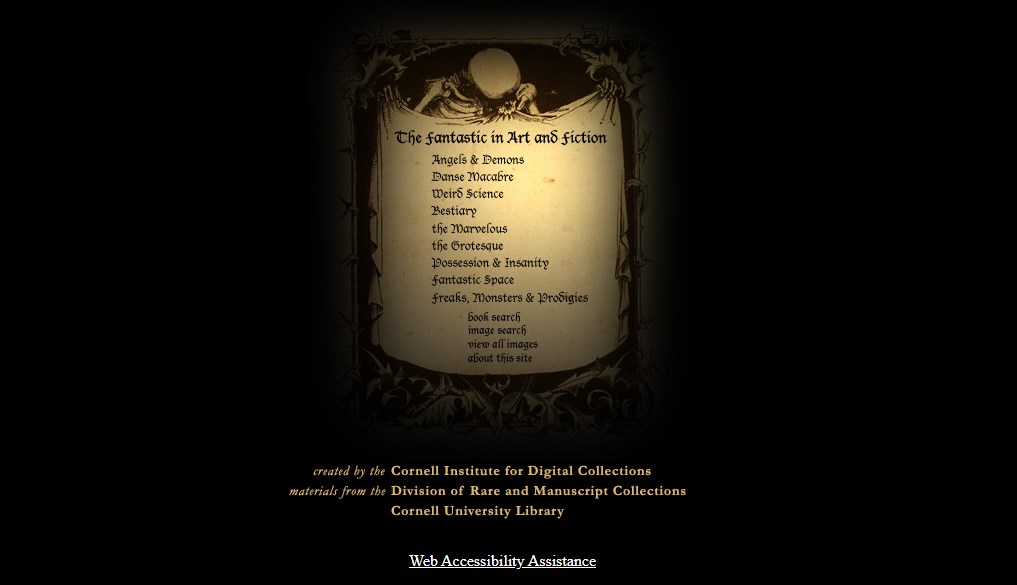
It is a highly recommended idea for website design intended for the Halloween festival. You can use the raining background video and silhouette section divider. But, it depends on the type of business your organization is dealing with. The fear inspired and dark hero header cannot be ignored that even engages more visitors to your website.
8. Bewitching Services Section
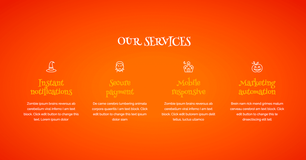
You can use the Halloween related tricks on your website services page. For example, the services like, secure payment, Instant notification, marketing automation, customer seller, candy and costumes, and terrifying edibles, etc. can be added. Different Halloween icon set can be used to make it more Halloween ready. So, add the trending and leading service your company is dealing with and give your customers the exact holiday feel.
9. Spooky CTA Integrations

For immediate sale, different Call to Action (CTA) factors can be used. It is a beneficial deal that can effectively showcase your website Halloweenify sales. Some features like horrible shape divider, the right font, and some grisly minus margins can be used.
There are other options, such as Contact forms, and the Pricing page, that can also be modified to add a bit of festive touch to your WordPress website. Additionally, different images that signify Halloween such as, Pumpkins, Witch’s house, Tree Silhouette, and Witchcrafts, etc.can be added to give an impression of Halloween. Though, it is a small suggestion that you can use on your website but has a significant impact on engaging more customers. Check out hauntworld.com that has added a contact form to find haunted houses nearby. The visitor has to fill in the details, like, Type Of Attraction, State, City and ZIP Code/Distance.
The other element that can give you benefit is treating your customers by integrating your pricing table of services using different Halloween background images. Halloween Background Different Colorful Pumpkins Black Bats, Seamless pattern with orange silhouettes, Different Halloween castles could be an option for you. Google has given us a plethora of options to go with. So, you can choose the one that best fits your requirements.
10. Design your brand logo ghastly ready

As we know that Google has provided doodle for different festive, so why not take advantage of it in this Halloween season? Surprise your customers by creating a logo that astonished them and simultaneously provides higher traffic on social media. This attempt varies from one organization to another. As every organization has its own aims and objectives. So, you can go with the one that reflects your brand. You can build logo by simply integrating a CSS and Javascript to make it more impressive. As shown in this example, hover over the logo is created. While moving cursor on the LOGO, you will see a flying ghost.
Let’s Make WordPress Website Mobile Friendly Today!
Wrapping Up
Now, now have it!! We have given you ten killer Halloween website ideas that you can use to make it Halloween ready.
A lot of businesses do not realize that festivals can give their business new heights by just playing smart. Don’t miss this opportunity.
Give your visitors coming to your website and keep them engaged. Let them visit your WordPress website again and again. All you have to do is to add a zest of Halloween to your site. That’s it!!
Do you have some other exciting ideas to primp your website for Halloween? If yes, then do share it with us!
And if you have any doubts related to our article, then let us know in the comment section below. Thanks for reading.
Have an uncanny, eerie, hair-raising, and sweet candy-filled Halloween!!


