Top 10 Exit Popups Ideas for Instant Boost in Conversion Rate
You must have wondered whenever you want to exit a website then all of a sudden a new window popups in your screen asking you to either subscribe to something or take advantage of an offer or download a pdf as a compliment or survey or anything related to the niche of the website. As a website owner, pop up is the last opportunity to request your visitor for one last time to stay on your website. So, if you are developing a WordPress website, exit popups can be a crucial asset.
You can ask visitors to participate in a survey, to subscribe your newsletter, or you can also offer freebies in exchange of their email to generate a lead. Here, in this article, I am going to provide you the ideas which can increase your website conversion rate.
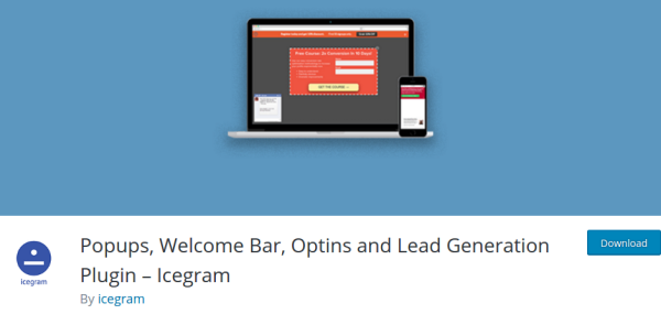 It is a “Popup, Welcome bar, Optin & Lead Generation” Plugin. Icegram enables you to create,
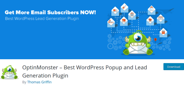 It is one of the most famous lead generation plugins. Optinmonster is powered by drag and drop builder which enables you to create stunning Exit popups.
 Thrive Leads enables you to create your own designs with the drag and drop editor.
 You should have a deep understanding of your audience. Take your own time and try to figure out all the things about your website audience. Now, you must be wondering exactly what to understand about your audience. The answer is just one word, “Everything”.
 Imagine an Apple website with a Windows-like popup (Do not overthink, I love Microsoft). Seems a bit odd aye. Of course, never ever create a popup that did not match your website’s class.
I have seen many websites which use poor quality popups not deliberately but maybe at that time they do not have time to construct a good one or maybe they can’t afford a good one. Whatever the reason may be these popups can significantly affect your website’s brand image and a plus (actually a drawback) of this will be the CTA for which that exit popup was made will also never be accomplished.
So, never settle for anything, just keep this quote in mind, “Be consistent to your brand, your audience will do the rest”.
 Remember, your visitor is grabbing the exit door and is about to go, so you need to catch their attention. You must design your exit popup in such a way that is eye-catching. The exit popup must catch the eye of the visitor or else they will go out without even noticing that and all your hard work will flush down into the gutter.
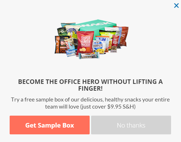 People often gets excited when they get something for free. And to be frank they eventually opt for it whether they like it or not. That’s the power of a freebie.
You can design your exit popup to stop the visitor and offer a free download of one of the ebooks you have, or if you’re from e-commerce market, you can persuade them to buy the product for an additional discount of some percent and avoid the bounce rate.
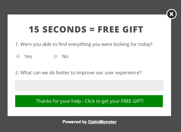 It is one the simplest method to gather information about your audience. Yes, you can add surveys to the exit popups, however, you need to be careful not to make lengthy surveys. Keep it short and simple.
But still, if you want to ask additional questions (Personally I do not recommend it) you can try including those questions in subsequent popups. While doing so, do remember to show a status bar so that your visitor must have an idea about the progress of the survey. If you didn’t add the progress bar, they might get annoyed and leave.
Conducting surveys about the related niche is recommended. Do not be nosy and be polite (and engaging coz you want your visitor to take part in the survey).
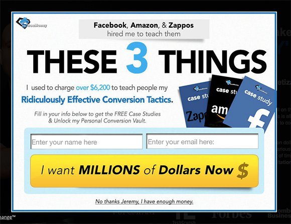 Your Call To Action (CTA) button is the one thing you want your visitor to click. And how will he click on the button if he couldn’t find it? You must design the CTA button out of the league with clear action word or else your visitor will leave.
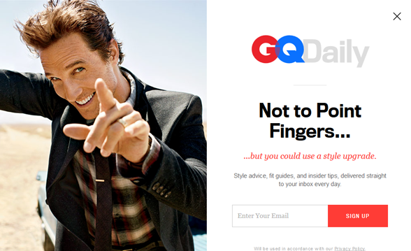 This point actually depends on your target audience. You can actually have some humor on the popup and believe me, it has superb positive responses.
You can catch their attention with funny quotes, memes, and cartoons. Animation or GIF images can be a huge asset to provide visually aiding task.
Make your pop-up interesting because viewers are accustom of popups and they’re very good at ignoring them.
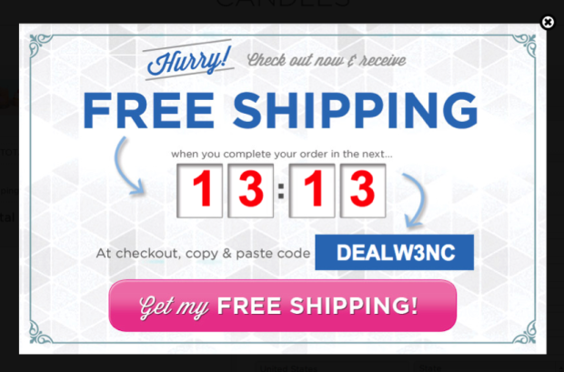 People tend to temporize when it come to tasks that are really not required for them. A Nice problem right? The solution is made them their requirement. Sound as this might be the last chance, and you’ll see how differently they will act.
If you’re using an exit popup for lead generation, make the visitors realize that few seats are open, after which you might not get the opportunity (Pro tip: Track your visitors every time and use different statements).
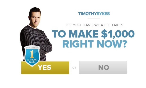 The time frame a popup exit have to make an impact can be measured in microseconds. You must strategize your popup in such a way that it would make the impact in a flash or it’ll be waste away.
What is an Exit Popup and How it can increase the website conversion rate?
Exit popups are basically those messages which arrive exactly when the user is about to leave your site. They map the pointer’s position and whenever they sense it is going away from the website layout area., this triggers the popup. They can include any message, CTAs (Call to Action), images, and surveys. Generally, popups are used for these purposes given below.-
Promotion and Sales
-
Lead Generation
WordPress Plugins That Lead Your Website To The Success
-
Warnings
-
Navigation
-
Surveys
TOP 3 EXIT POP-UP TOOLS -
1. ICEGRAM It is a “Popup, Welcome bar, Optin & Lead Generation” Plugin. Icegram enables you to create,
- Well timed Popups.
- Beautiful Action Bars.
- Commotion Notification.
- Alluring Slide-in Messengers.
- It has four different types of options,
- Header and Footer Action bars.
- Slide-in Messengers.
- Lightbox popups.
- Toast Notifications.
 It is one of the most famous lead generation plugins. Optinmonster is powered by drag and drop builder which enables you to create stunning Exit popups.
- Enables you to differentiate your customers by segmenting them in accordance with their behavior.
- It also enables you to conduct A/B test to evict the guess work.
 Thrive Leads enables you to create your own designs with the drag and drop editor.
- All the popups are mobile optimized.
- Created with clean codes and compatible with all the browsers.
- It spawns you with cutting edge lead generation forms which includes -
- Checkboxes.
- Radio Buttons.
- Drop Downs.
- Multiple Fields.
Top 10 Exit Popup Ideas.
#1. UNDERSTAND YOUR AUDIENCE
 You should have a deep understanding of your audience. Take your own time and try to figure out all the things about your website audience. Now, you must be wondering exactly what to understand about your audience. The answer is just one word, “Everything”.
Get closer to your target audience with an attractive WordPress website!Yes, it is the answer. You must be wondering how can you know everything about your audience. Here’s the hint. Know everything about your audience which can potentially benefit your business. These things can have an emotional conundrum or a material desire. Understand their need and they will do exactly the thing you want them to do. Once you understand your audience’s conscience, you’ll present them the things which will attract them and that’s it, they’ll be yours for taking.
#2. CONSISTENT BRANDING IS A KEY TO EVERYTHING
 Imagine an Apple website with a Windows-like popup (Do not overthink, I love Microsoft). Seems a bit odd aye. Of course, never ever create a popup that did not match your website’s class.
I have seen many websites which use poor quality popups not deliberately but maybe at that time they do not have time to construct a good one or maybe they can’t afford a good one. Whatever the reason may be these popups can significantly affect your website’s brand image and a plus (actually a drawback) of this will be the CTA for which that exit popup was made will also never be accomplished.
So, never settle for anything, just keep this quote in mind, “Be consistent to your brand, your audience will do the rest”.
#3. MANEUVER ATTENTION
 Remember, your visitor is grabbing the exit door and is about to go, so you need to catch their attention. You must design your exit popup in such a way that is eye-catching. The exit popup must catch the eye of the visitor or else they will go out without even noticing that and all your hard work will flush down into the gutter.
Wordsuccor can help you get attention with a customized WordPress website!Use striking images, bold letters, persuasive tone. Slide in the popup and they will catch the eye of the visitor. An attention grabbing headline with a vibrant image is a perfect blend. Make the popup impactful and things will turn into your way.
#4. TWITCH THE POPUP’S BEHAVIOR
Now, here’s one condition, imagine yourself as one of the subscribers of your website. When you exiting the website and a popup catch your eye, which says “Subscribe to our newsletter”. You must be annoyed, as you already are a subscriber. It is fine if you’re using the above line but only for new visitors. There are settings through which you can actually make different popups for a different set of visitors. This will make your subscribers feel valued and the other popup will provide the service as normal.#5. OFFER FREEBIES
 People often gets excited when they get something for free. And to be frank they eventually opt for it whether they like it or not. That’s the power of a freebie.
You can design your exit popup to stop the visitor and offer a free download of one of the ebooks you have, or if you’re from e-commerce market, you can persuade them to buy the product for an additional discount of some percent and avoid the bounce rate.
Get a FREE quote for your new WordPress website today!If we look at the early researchers, it is a fact that these freebies have the potential to decrease the bounce rate significantly.
#6. CONDUCT SIMPLE SURVEYS
 It is one the simplest method to gather information about your audience. Yes, you can add surveys to the exit popups, however, you need to be careful not to make lengthy surveys. Keep it short and simple.
But still, if you want to ask additional questions (Personally I do not recommend it) you can try including those questions in subsequent popups. While doing so, do remember to show a status bar so that your visitor must have an idea about the progress of the survey. If you didn’t add the progress bar, they might get annoyed and leave.
Conducting surveys about the related niche is recommended. Do not be nosy and be polite (and engaging coz you want your visitor to take part in the survey).
#7. MAKE YOUR CTA BUTTON UNIQUE
 Your Call To Action (CTA) button is the one thing you want your visitor to click. And how will he click on the button if he couldn’t find it? You must design the CTA button out of the league with clear action word or else your visitor will leave.
Hire WordPress developers to build a unique product/services website!You just have few seconds to hit the visitor with a sparkling CTA button. So, make sure you designed it different and attractive at the same time.
#8. TRY FUNNY POPUPS
 This point actually depends on your target audience. You can actually have some humor on the popup and believe me, it has superb positive responses.
You can catch their attention with funny quotes, memes, and cartoons. Animation or GIF images can be a huge asset to provide visually aiding task.
Make your pop-up interesting because viewers are accustom of popups and they’re very good at ignoring them.
#9. EXPRESS CRITICAL NATURE
 People tend to temporize when it come to tasks that are really not required for them. A Nice problem right? The solution is made them their requirement. Sound as this might be the last chance, and you’ll see how differently they will act.
If you’re using an exit popup for lead generation, make the visitors realize that few seats are open, after which you might not get the opportunity (Pro tip: Track your visitors every time and use different statements).
#10. USE SOLID NUMBERS
 The time frame a popup exit have to make an impact can be measured in microseconds. You must strategize your popup in such a way that it would make the impact in a flash or it’ll be waste away.
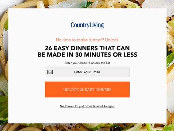
We customize WordPress plugins to help you extend your website functionality!Try using numbers. By numbers I mean stats. Some figure to show how many people have subscribed till that time, or percentage of visitors positive about the thing you’re offering. Stuff like that can actually persuade your visitor and make him stay for longer durations. It's a Mission Accomplish for you. Winding up Exit popups are your final opportunity to convert a visitor into a subscriber or into a customer or into a regular customer. You need to execute the exit popup correctly and effectively. In return, they will give you solid leads, lower bounce rates and boost your sales. Please share this post to spread the tactics and if you have other ideas to boost up your leads and sales, shoot me a comment and I will get back to you.


